Saturday, April 14, 2018

CCR


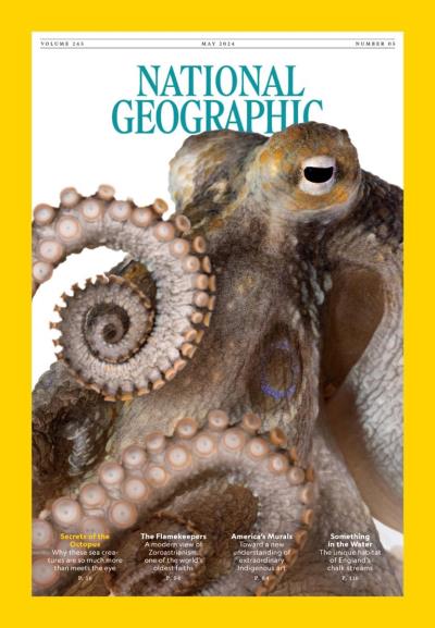
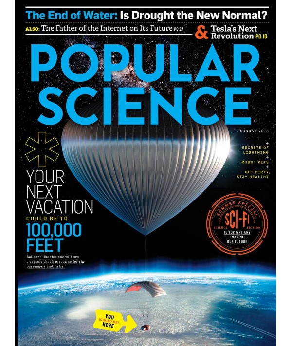
1.How does your product use or challenge conventions and how does it represent social groups or issues?
     While my magazine does not necessarily challenge conventions, it definitely does use them in order to appeal to its target audience. The target audience, which has morphed throughout the creation of this project, is finalized to be airplane pilots and those interested in becoming pilots. After performing research regarding this specific social group, It was evident that this group of people are most generally middle-aged men, sitting in the upper class. To target them most efficiently, I went through the process of viewing the covers of various similar magazines and recording what their main articles are about. After doing this and viewing the list, a recurring sub-theme, besides aviation, of course, was evident. Most of these covers mentioned articles which had to do with explaining certain parts of aviation. Because of this, I decided to create an article about the science behind the plane, which directly appeals to the curiosity of younger and upcoming pilots. An article such as this one would obviously not attract more experienced pilots, but, as seen in the table of contents, the magazine is comprised of a mix of various types of articles which, as a whole, appeal to most of the piloting field. Since my magazine does not have anything to do with problems in society, it doesn’t represent any social issues.

2. How does your product engage with audiences and how would it be distributed as a real media text?
     As stated in the previous question, my magazine has articles which are directed towards interests of its target audience, which are pilots and those interested in becoming pilots. To engage with this audience, there is a range of articles that cover pretty much the whole piloting field, such as plane reviews, interviews, tips, lessons, and other topics of interest.
       To distribute my magazine, I first have to look at where exactly my target audience tends To be frequently, and there is no clear answer to that. Selling magazines in storefronts will simply not be efficient, as approximately only 0.18 percent of the US population are pilots. Because of this, my magazine will be primarily a subscription magazine, in which magazines will be mailed periodically to the subscriber. Along with this, and the fact that the majority of people, including pilots, have smartphones, my magazine will also be available digitally. This allows the subscriber to have direct access to their magazines, considering they are almost always moving, and will create a significant amount of savings as digital copies of magazines require no paper and minimal expenses to distribute, compared to paperback magazines.
 
3. How did your production skills develop throughout this project?
       To design my magazine, I began by using simple ideas we were taught in class, such as the basic design of most magazines, and, more importantly, the bad design decisions which can be made whilst designing one. While that is an important aspect of the decisionmaking in this project, in my opinion, it mainly has to do with visuals, and what colors clash together and which don't. While I could’ve looked up at the beginning which are acceptable color combinations, I chose to follow a simple trial And error process in which I simply play around with color settings, font designs, sizes, and positions to see what works and what doesn’t. Because of this learning experience, in the future,  will be able to design more attractive texts without needing to go through all of that again.
4. How did you integrate technologies – software, hardware and online – in this project?
        In the beginning, in the research phase of the project, I began by using this website called google.com. It is a quite astonishing resource, really. It allowed me to search the internet for pretty much whatever I needed to find, as long as it is online somewhere. Software-wise, I used this graphics editing/ creation program which comes built-in on windows computers. It’s called Microsoft Paint and was an essential resource in the creation of the drafts which I planned. While it isn’t, by definition, software, as its an online resource, Canva was the single most important site I used for the creation of my magazine. It is a website which allows you to create magazines and various other types of posters, with hundreds of templates to choose from. Hardware-wise, I haven’t really used any physical objects for this project, other than my computer and phone camera to work with.

Final Magazine

Drumroll Please...
The moment we've all been waiting for, the completion of this cursed project.


Wednesday, April 11, 2018

CCR Plans

For the CCR, I am required to create a video of me answering several questions given in the project instructions. Here they are:

1. How does your product use or challenge conventions and how does it represent social groups or issues?
2. How does your product engage with audiences and how would it be distributed as a real media text?
3. How did your production skills develop throughout this project?
4. How did you integrate technologies – software, hardware and online – in this project?

While there aren’t many instructions as to what process one should follow when creating the CCR, after viewing various projects, it seems like most people are simply answering the questions in essay form and merely reading out their responses. I feel like it would come out better if I went through the individual questions and answered them one by one, using on-screen edits to create a more engaging video which is easier to follow.
I do not feel like I should post my written responses to these questions, as it would be redundant to do so and then post a video repeating the same answers.

Monday, April 9, 2018

Advertisement thoughts

In the process of brainstorming for possible items to advertise in my magazine, I came up with a couple of options. The main one would predictably be Aviator glasses. This is a very viable option as they are easily accessible and are actually used by most pilots. Making this advertisement is pretty self-explanatory and I’m not going to go through it step by step.

Another item that could be advertised in my magazine is flying apparel. Because pilots are generally sitting down for hours on end, it would be sensible for them to wear comfortable clothing. To satisfy this need, I could advertise clothing which is designed specifically for this purpose and therefore advertises directly towards the target audience. This could be anything such as shoes, socks, pants, and shirts. This gives me a lot of leeway for different pictures and allows me to test different variables to see which looks better after being inserted in the magazine.

UPDATE: Because of the long nature of my article, I was not able to include any advertisements in my magazine.


I could really use a honey bun rn

Sunday, April 8, 2018

New Target Audience Research

As mentioned in my previous posts, I had to make the choice to drop the rather vague 'science' magazine and go for a much more specific target audience. While it's not what I initially intended, such is life, and I just compromise and move on. At the moment, it seems like it will be directly to people interested in becoming pilots and pilots themselves. A quick google search shows the magazine called "Flying", which consequently is one of the most popular airpcraft-related magazines in the world. Here is a quote from the source: "pilots, aircraft owners, aviation enthusiasts and aviation-oriented executives in businesscommercial and general aviation markets worldwide." So, while my magazine isn't going to be as 'commercial', I should be able to target it towards various sides of the aviation market. 

After performing a through search on the average age of pilots, I have come to the conclusion that they are mainly middle-aged, with the mean right around 45 years old. Another search shows various surveys completed by various company, all of which determine the average pilot salary to be around $130,000 a year. This puts them directly in the upper class, with the middle class ranging up to $75,000 a year. This means that in my advertisements, I shouldn't really be looking to sell cheap or common products, but instead try to sell the audience something rather exclusive. As of the moment, I don't really have a realistic idea for what to sell, but I'll keep you guys posted.


(n.d.). Average age of airline pilots worldwide 2016 | Statistic. Retrieved April 08, 2018, from https://www.statista.com/statistics/739969/average-age-of-airline-pilots/

The upper middle class grew to 29.4% of the population in 2014. (n.d.). America's upper middle class is thriving. Retrieved April 08, 2018, from http://money.cnn.com/2016/06/21/news/economy/upper-middle-class/index.html

Average Commercial Airline Pilots Salary. (n.d.). Retrieved April 08, 2018, from http://work.chron.com/average-commercial-airline-pilots-salary-11855.html

Friday, April 6, 2018

Table of Contents Draft

So, in my last post, I showed my draft for the cover of the magazine. In this post, here's a picture of the first page of the table of contents which I've compiled thus far. I still have to do the extra research for the target audience, so I'm holding off on deciding what other images/advertisements I will be placing throughout the magazine.
Now, while I don't really know much about my target audience, I know it's about small plane pilots. So, in the meantime, I chose these airplane-related headlines as placeholders until I do more.

Tuesday, April 3, 2018

Assembling the cover page

In the last few posts, I’ve been going through the aspects of the cover, and in this post, I will be using a magazine designing website called "Canva" to compile them. Here is what I've got so far.
Obviously, there are various articles here that have a similar topic, along with the temporary title, which has to do with planes. While I initially planned on making a scientific magazine, I took a glimpse into the other items that I would need to include in my magazine, and it would be much harder to make advertisements for scientific 'stuff' than a more specific target audience.

With this change, I will have to re-do my research on my target audience, which is possibly a lot different than the initial plan.

Saturday, March 31, 2018

Quick Background Possibilities

So, while I'm speeding through the design part of the magazine, I still have one problem to overcome before I'm in the clear: The background.

As seen in the designs, I plan to include some sort of dark background for any of the designs, but I literally have no idea as to what I could use for that, and I'm pretty sure I need to make this image myself, so I can't use anything from the interwebs to do it, and has to be something from around my house or outside. Initially, I thought of trying to take these photos using the night sky as the background, but quickly, the whole plan fell apart after realizing that I live in a swamp, and going outside with a bunch of lights in the middle of the night is slightly attractive to insects. That, and it would just be extremely hard to pose the paper airplane in mid air rather than laying it on a hard surface. I could always use a green screen, but after doing various green screens for our music video project, no thanks, not again.

So, I will resort to looking for various dark surfaces I could use as backgrounds for my image, and post the images of the most interesting ones here.

Mouse mat:
I have this whole-desk gaming mouse mat from Corsair, and I'm not sure whether or not I can use it effectively as a background, but it's pretty dark colored and has an amazing design.
So uhh... After searching around for a hot minute, it seems to be that I have no other viable options for background images, so with one choice left, I have decided to use the mouse mat as my background image.

Thursday, March 29, 2018

Cover Template Opinions

Before getting started with this post, I want to thank everyone who has been following my blog and giving me suggestions for my project. It truly amazes me how so many people are interested in it. I can't believe I have gotten a total of 11 views! Wow! That's more than I can count with my fingers!

So, with that out of the way, last post I had drawn up some sketches of possible cover templates I could follow for my magazine. In this post, I will quickly go over each option and say my opinions.

Design #1:
I feel like this design would be one of the easiest ones to make, as the paper airplane would be face down on the background, eliminating a lot of lighting problems created otherwise. But, for some reason, I feel as if it won't be as pleasing to the eye as the other ones.

Design #2:
Being the most pleasing design to the eye, I personally think that this design, if followed properly, could lead to a very well-looking magazine cover. The main problem I see in this design is that the cover image covers only a very small portion of the cover, and the rest would need to be filled by a background, which I need to figure out how to aquire.

Design #3:
Being pretty hard to draw a 3d paper airplane in Microsoft paint, this sketch does not do justice for the image I had planned in my head, and looks a bit confusing at first, but the simmetry in this design if by far the most attractive of the three. This one seems to be the most problematic, as it suffers from the same problem as design #2, and it will also be pretty difficult to photoshoot, as the plane would need to be facing the camera, raising problems such as lighting and how I am going to hold the plane in place.

Tuesday, March 27, 2018

Cover Planning

As decided in my last post, I will be doing a cover incorporating some sort of paper airplane. While this isn't my primary choice or what I initially hoped to do, I amn running very low on time and needed to make a choice, as I'm actually far behind the schedule.

In this post, I will post various drafted template designs for the cover of the magazine, and hopefully talk about them individually. If I don't get to talk about them, I guess I'l do it in the next post.

Design #1:

Design #2:

Design#3:
I made all of this with a free, professional photo editing and creating software called Microsoft Paint.

Sunday, March 25, 2018

Suggestion #3 Consideration

Following in the footsteps of my last two posts, this is the last suggestion that was derived from the group activity we did last week.
Cooking Magazine
     So, after everyone ran out of ideas to give me, one last idea popped up, and that was to just change the entire genre of the magazine alltogether. While I normally would never consider such a suggestion, at this point, I'm getting pretty desperate to get to work, and if this is my best option, then so be it.

     Cooking magazines have pretty much a common cover image, and that's simply a picture of a certain food, that will be spoken about in the primary article. Because of this, this idea seemed pretty enticing at first, as food is generally easy to come by.

     So, naturally, the whole group agreed that this was pretty much the choice to go by, as it seemed to be the least complicated one to go for.

     One problem, though: I can't cook for crap

     On a second note, my grandma can cook well, but not really pretty. By this, I mean, that while the food tastes extremely delicious, it is not very photo-friendly, and lacks color, which is one of the most noticeable things in food magazine covers.

     Lastly, as stated in the plant article suggestion, this genre is not one that interests me, and, while I may be able to jump ahead on this stage of the project, I will definitely have problems writing the article, which will be reflected in the quality of the magazine when it's done. On the other hand, if I take more time working on a cover about a topic which interests me, I could take less time writing the article but still have it be of quality.

The Final Verdict: While very possible, I feel like this whole cooking thing is really a stretch for me, so I have decided to not do it. Having knocked out two of the three suggestions, only one stands: the paper airplane cover. Hopefully, in the following week I will be able to figure out how to do this in an attractive yet less-complicated manner than initially predicted.

Friday, March 23, 2018

Suggestion #2 Consideration

Two postings ago, I spoke of the group activity we did in class, where we each explained our progress in our projects and gave suggestions to one another. In my case, I got 3 different suggestions. In the last post, I went through the first one, and in this post, I will be going through the second one.

Paper Airplane cover image
     So, the never-ending problem of being able to find a viable cover image for a science magazine is still alive and breathing. I've been stuck on this part for weeks now, and haven't been able to make much progress because of it. The basic premise of this suggestion is that I apply one of my main interests, which is aerospace engineering, to be my main article for the magazine. While this sounded like a great idea, I would also need an image of a plane to use as a cover, as most magazine covers are actually about the primary article in the particular magazine.

     After some quick brainstorming, we decided that pretty much the only sane way to approach this problem is to photoshoot an airplane that everyone has access to; the paper airplane.

     Making a paper airplane and taking a picture of it is an extremely easy thing to do. The hard part would definitely be filling up the rest of the cover with 'depth'. Some of the main problems that will arise would be the background, as it can't be the same solid color, as it would look pretty bad. But, as I'm pretty much scraping the bottom of the barrel, I wouldn't look too far, as I'm reaching the point where I have to make a choice- good or bad- and get on with it.
The Verdict: Very Possible

Tuesday, March 20, 2018

Suggestion #1 Consideration

       As stated in my previous post, the first suggestion given to me by my group was to do an article about plants. While I do not find botany the least bit interesting, I have left this as a viable option for a scientific article, as my other initial ideas were shot down almost immediately due to budget or complexity.
       After searching through Google Images for examples to get ideas from, I drew a blank. Most of the magazines with plants as covers were about gardening, which is simply not going to work for me. The other magazines, which were about science, were very heavily altered through Photoshop to look much different than the original image, which, for an amateur like me, will not go well at all. So, because of this, I would be pretty much running blindfolded while creating this magazine, as there is no other sample to reference myself to.
       I would have gone outside and attempted to begin looking for certain things to take pictures of that I could potentially write about, but I had already gone ahead to look for examples-which there are none.

The final verdict: I will not be pursuing this option

Sunday, March 18, 2018

Group Work Thoughts

In the previous post, I explained what we did in class and what recommendations I received from my partners. In this post, I will look further in depth at each of the three possibilities, weighing the pros and cons of each.
1. Doing an article about plants
Obviously, an article about plants is still a sci toxic article, but it' a very different science than the initial thought I had. A pro would definitely be accessibility, as there are many different plants that can be found to photograph for my images. A con would probably be the lack of interest from me on this topic. I picked a science magazine because I am thoroughly interested in physics, especially aerospace. Plants are not really an interesting topic for me, so I will probably struggle a bit to write about it, but in that sense, with option 3, I would also alter my topic completely, so it seems that I just chose a bad topic to attempt to portray.
2. Paper airplane cover
The recurring problem here is that I have no feasible way to photograph anything relevant to the topic which I wanted to make my article about, which is aerospace. The idea here is to somehow take a good-looking photograph of a paper airplane. A pro would be that I'll be able to continue the idea that I began with. A con would be that it would be difficult to take a picture that will match my scientific theme. It would be good to note here that this was the least preferred option by my group.
3. Cooking Magazine
Being the most preferred idea of the group, it seems that I dug myself a grave here by choosing a scientific magazine. The idea is basically that I'm going to scrap the whole idea of a science magazine and start over with a much simpler idea of a cooking magazine. A pro would be the accessibility of materials to photograph. The cons would be that obviously um going to have to redo all my work (which, honestly, isn' that much) and that I'm not very interested in cooking, which will be reflected when I need to write an article about it.

Friday, March 16, 2018

Group Work

In class today, we were partnered in groups of 4, two of which were working on magazine project and two which were working on the film opening. In these groups, we went around the table to speak of our project, our ideas, progress, and concerns.

During my turn, I explained all my ideas to my group and my overall progress. Then, I explained the problem which is very clear in the horizon: figuring out what to do with the cover image. Most science magazines have very uncommon things for their cover images, but I am not going to be able to access such objects to photograph. As the group conferred, we came up with only three different viable routes I could take:
1. Take a picture of a plant, and use that as my main article
2. Do something with a paper airplane, and speak of the science of the airplane
3. Change my theme completely, and do something else much more feasible, such as a cooking magazine.

Saturday, March 10, 2018

Misc Brainstorming

So, after looking through many different styles of magazine covers, I'm beginning to start liking darker-colored templates. Some examples would be the Popular science cover, as seen in my previous postings, and most of the Science magazine covers, which tend to be only black and white, but here is a non-binary example:
About the Cover. (2015, June & july). Retrieved March 9, 2018, from https://d2ufo47lrtsv5s.cloudfront.net/content/sci/349/6245/F1.medium.gif


I just feel like in the end of the day, it would be a lot less work, as I wouldn't need t oworry about 

color matching, and it just gives it a much cleaner and sleek look. But again, it all depends on how well I make my cover image, and the problem there is that, while I tried to plan it out a bit in my last post, I ended up not being able to come up with much other than a direction, as I'd need to design the rest of my magazine's template first.

A quick note that I just realized about these magazine covers, including the ones I was analyzing two posts ago, is that the cover images are primarily symmetrical, other than the NatGeo, which is rotated. Upon looking at them a bit more and doing a quick search for other magazines, it seems like it's not that common of an occurence, at least in scientific magazines. This could mean two things:

 1) It's merely a coinsidence.

or

2) They actually look more attractive and I picked them subconsciously.

While I can't say for sure, I'm really starting to dig the very simplistic style of the cover layout, with very unintrusive headlines that draw little to no attention, and let the reader see the whole cover image. When I begin to sketch out my magazine's cover, I hope to be able to create one as simplistic as the examples I've seen so far, but nothing is yet to be written in stone.

And, having given a quick thought as to what I could possibly be the title of the magazine: I have no idea, so if anyone wants to give me any ideas as to what name I could pick, make sure to leave a comment below, I'm open to suggestions!

Thursday, March 8, 2018

Cover Image Brainstorming

In this post, I will be talking about the different types of cover images and trying to figure out which would be the best to use in this magazine.
         Based off of a quick search on google images, it is obvious that most science magazines use objects as cover images, which is very different from most other genre magazines which feature people, generally looking at the camera. While science magazines with people on the front are rare, the ones that do include people are speaking of very famous people, such as Albert Einstein. Since I obviously cannot get a famous person to take a picture of them for my magazine cover, I will go with option A. This means that I'll need to find or create an image of something scientifically interesting. As can be seen in a google search of scientific magazines, the cover images tend to be very edited, and many being simple animated images, but some of them are actually images of recent inventions which an article is based on inside the magazine. I actually like this idea, and do plan to investigate it further in the future.
      Now, with an idea of what type of picture I should have on my magazine cover, I need to figure out what my possibilities are to take pictures of. First, I obviously can't get a brand new prototype device to photoshoot and write about, so I'm thinking of taking an alternate route and writing an article of old electronics. While many people nowadays are tech savvy, we are coming to the point where young adults (which happen to be my target audience) grew up with new technology, and never got to experience the old and exciting tech. Being a teenager, I find old technology fascinating, and I'm sure my target audience will too, both as a history lesson and as a science lesson. While I don't have any old technology around, I'm sure it wouldn't be too hard to source possible devices to take pictures of and include in my article.
    After thinking about this for a bit, I have decided to hold off on thinking about the cover image, as I feel like it would come out a lot better if I decide the image once I have my cover template already designed.

Tuesday, March 6, 2018

Further Magazine Analysis

In this post, I will begin to go through all the stylistic aspects of both of the magazine covers I'm looking at for inspiration.

National Geographic:

 The main identifier of National Geographic magazines is, most noticeably, the yellow rectangle which borders the cover page. I find this to be a very good stylistic choice because it is very noticeable compared to other magazines, and it really complements the yellow and white theme of National Geographic. What I don't like about this cover, or most of the other National Geographic covers, is that they don't complement very well with the cover image. In this example, the cover image is a picture of a satellite in space. While the black of space looks well right next to the yellow border, I feel like the blue/white surface of the earth doesn't look well with the yellow border. To fix this, I will try to play around with different colors, thicknesses, and styles depending on the cover image so as to have the most aesthetic look.
The New Big Brother Archives subscribe. (2018, January 15). Retrieved March 01, 2018, from http://press.nationalgeographic.com/tag/the-new-big-brother/

Popular Science:

Similar to Natgeo's cover image, this magazine, and many other popular science magazines, have covers with images of space. Now, while I feel that the best cover image for a science magazine would also be from space, as a high school student, I don't really have the budget to go to space and take such a picture, so that's out of question. What I really like stylistically about this cover is how they vary their font colors (compared to National Geographic always using the same white/yellow), to get the best conntectiom between the cover image and the font. In this particular magazine, which also has a picture of earth from space, the font choices, which I find excellent, are white and blue, similar to that of the picture. For my magazines cover image, I hope to be able to capture an image that has no more than two main colors, so that I'll be able to do as good a job as Popular Science did in creating a very visually appealing magazine cover.
Space Balloons, Science Fiction, And More From August 2015. (2015, August). Retrieved March 1, 2018, from https://www.popsci.com/space-balloons-science-fiction-and-more-august-2015


      Overall, I find Popular science's choice of font color and style to be more appealing than National Geographic's. Some key differences are that, in NatGeo, the main story title is actually bigger than their masthead. Obviously, they are able to do this as they are such a well-known magazine and are very recognizable even without the title. Since my magazine is just starting, I will need to make the masthead the most appealing thing on the cover, besides the cover image. What I do like more than popular sciences is natGeos use of story titles. While popular sciences gets very crowded towards the sides of the cover, NatGeo's is very open and simplistic, which I find attractive. I'm really looking forward to beginning to create the contents of my magazine in the future.

Saturday, March 3, 2018

Genre Brainstorming

Hello peeps.
As I spoke about in my blog posting, I plan to, by the end of this posting, have a general understanding of the target audiences of popular scientific magazines, in order to be able to shape my magazine into the best form it can be so as to best address my target audience.

Target Age group
One of the most important aspects of target audiences is the age group. A child, for example, will most likely be attracted towards toys, video games, and other such concepts. An adult, on the other hand, will most likely be attracted towards adult topics, such as history, science, news, drama, and many other different genres, whose interests greatly vary depending on gender and personal interests.

For scientific magazines, such as National Geographic, they state no very specific age range, but it can be inferred that, since children don't really read magazines, that it's age range would be somewhere between teenagers and young adults. In my magazine, I hope to reach towards teenagers rather than young adults. This is, because while young adults have already begun their careers, teenagers haven't, and being inspired by inventions and innovations is a great way to help people enter scientific field jobs.

Target Social-economic Status
Social-economic status has a great impact on whether or not a certain person would be interested in a certain topic.
According to a research done by the US National Library of Medicine, young adults are much more likely to follow their primary interests if they are middle to upper class. This means that, in relation to the general interest in a certain topic, a well-off person with scientific interests would have no problem with reading scientific magazines, whereas a lower-class individual would normally see it as an improbable 'dream' and disconnect from it and focus more on their everyday life.

The conclusion here is that, to get the best sales possible, my target audience would need to be middle to upper class individuals who have the ability to go to college.

Target Gender
Historically, most scientifically-oriented magazines have had a male target audience. Nowadays, on the other hand, most scientific magazines nowaays have a pretty unisex target audience, many who don't even mention genders, unless speaking of a certain person.

For my magazine, I plan to, as most modern magazines, have a gender neutral target audience,r which widens the scope of the possible sales I could get compared to having an only male or female target audience.

Socioeconomic Status Modifies Interest-Knowledge Associations among Adolescents. (2012, July 1). Retrieved February 1, 2018, from https://www.ncbi.nlm.nih.gov/pmc/articles/PMC3375828/

Friday, March 2, 2018

Schedule planning...

So, for these first two weeks, I am beginning to create a schedule for future blog posts and setting certain goals I plan to reach within each post. Starting with the next post, my main goals are as follows; but I must keep in mind that, as I research more and make progress through this project, many ideas and general directions might change, so I wouldn't consider this as being written in stone:
1. Genre Research:
       In this post, I plan to look further into the main components of scientific magazines, and get more information bout them, such as their main customer's statistics, such as age, gender, race, and so on, so that in the future, I will be able to adjust my magazine to the best of my ability so as to best address my target audience.

2. Further Magazine Research:
       In this post, I hope to look deeper into the visual components of popular magazines and pick which designs I may use in the future to base my magazine design off of.

3. Cover Image Research:
       By the end of this post, I hope to have decided what types of cover images I will be planning to use in the final magazine cover. This is a very primitive step, in the sense that the best image really depends on how well it fits in to the rest of the magazine design, so I hope to at least have a idea of what pictures I'll need to take in the future.

Thursday, March 1, 2018

And thus it begins...

 Hello, my name is Brian, and I have decided to create a magazine that reflects my own interests. Because I am very scientifically oriented, my magazine will be based off of engineering and scientific Innovations and inventions. In the future, I will need to figure out how to reflect this theme using different font types and images, but for now, I will begin to research and include different magazines which I find visually appealing to later attempt to create my own design based off of theirs.
--------------------------------------------------------------------------------------------------------------------------
National Geographic is one of the most appealing ones for me; it’s simple and is very attractive to the eye. Because of this, I chose it as one of my favorite magazines.
The New Big Brother Archives subscribe. (2018, January 15). Retrieved March 01, 2018, from http://press.nationalgeographic.com/tag/the-new-big-brother/
-------------------------------------------------------------------------------------------------------------------------
Popular science is another magazine which I also find visually appealing. In the near future, I will delve deeper into all the components of each of these magazines, but for now, I'm simply looking for inspiration I could use in the future to create my own magazine cover.

Space Balloons, Science Fiction, And More From August 2015. (2015, August). Retrieved March 1, 2018, from https://www.popsci.com/space-balloons-science-fiction-and-more-august-2015