National Geographic:
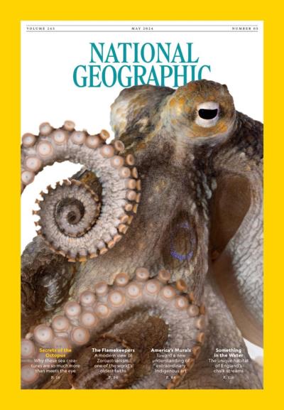
The main identifier of National Geographic magazines is, most noticeably, the yellow rectangle which borders the cover page. I find this to be a very good stylistic choice because it is very noticeable compared to other magazines, and it really complements the yellow and white theme of National Geographic. What I don't like about this cover, or most of the other National Geographic covers, is that they don't complement very well with the cover image. In this example, the cover image is a picture of a satellite in space. While the black of space looks well right next to the yellow border, I feel like the blue/white surface of the earth doesn't look well with the yellow border. To fix this, I will try to play around with different colors, thicknesses, and styles depending on the cover image so as to have the most aesthetic look.
The New Big Brother Archives subscribe. (2018, January 15). Retrieved March 01, 2018, from http://press.nationalgeographic.com/tag/the-new-big-brother/
Popular Science:
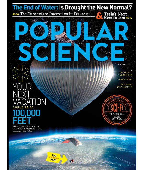
Similar to Natgeo's cover image, this magazine, and many other popular science magazines, have covers with images of space. Now, while I feel that the best cover image for a science magazine would also be from space, as a high school student, I don't really have the budget to go to space and take such a picture, so that's out of question. What I really like stylistically about this cover is how they vary their font colors (compared to National Geographic always using the same white/yellow), to get the best conntectiom between the cover image and the font. In this particular magazine, which also has a picture of earth from space, the font choices, which I find excellent, are white and blue, similar to that of the picture. For my magazines cover image, I hope to be able to capture an image that has no more than two main colors, so that I'll be able to do as good a job as Popular Science did in creating a very visually appealing magazine cover.
Space Balloons, Science Fiction, And More From August 2015. (2015, August). Retrieved March 1, 2018, from https://www.popsci.com/space-balloons-science-fiction-and-more-august-2015
Overall, I find Popular science's choice of font color and style to be more appealing than National Geographic's. Some key differences are that, in NatGeo, the main story title is actually bigger than their masthead. Obviously, they are able to do this as they are such a well-known magazine and are very recognizable even without the title. Since my magazine is just starting, I will need to make the masthead the most appealing thing on the cover, besides the cover image. What I do like more than popular sciences is natGeos use of story titles. While popular sciences gets very crowded towards the sides of the cover, NatGeo's is very open and simplistic, which I find attractive. I'm really looking forward to beginning to create the contents of my magazine in the future.
No comments:
Post a Comment